I’m doing something I rarely do. Talking about a piece of Thornley Fallis‘ work.
But I just have to point to something that makes me very, very proud – a blogger outreach pitch that our team did this week for the Sharp Aquos XS1. That’s the new thin, thin HD television that Sharp has introduced. Thin? 1″ at its thinnest point.
Smart people have taught me that great design is knowing what to leave out so that you can get at the essence of something. And that leads to simplicity. And impact. And comprehension.
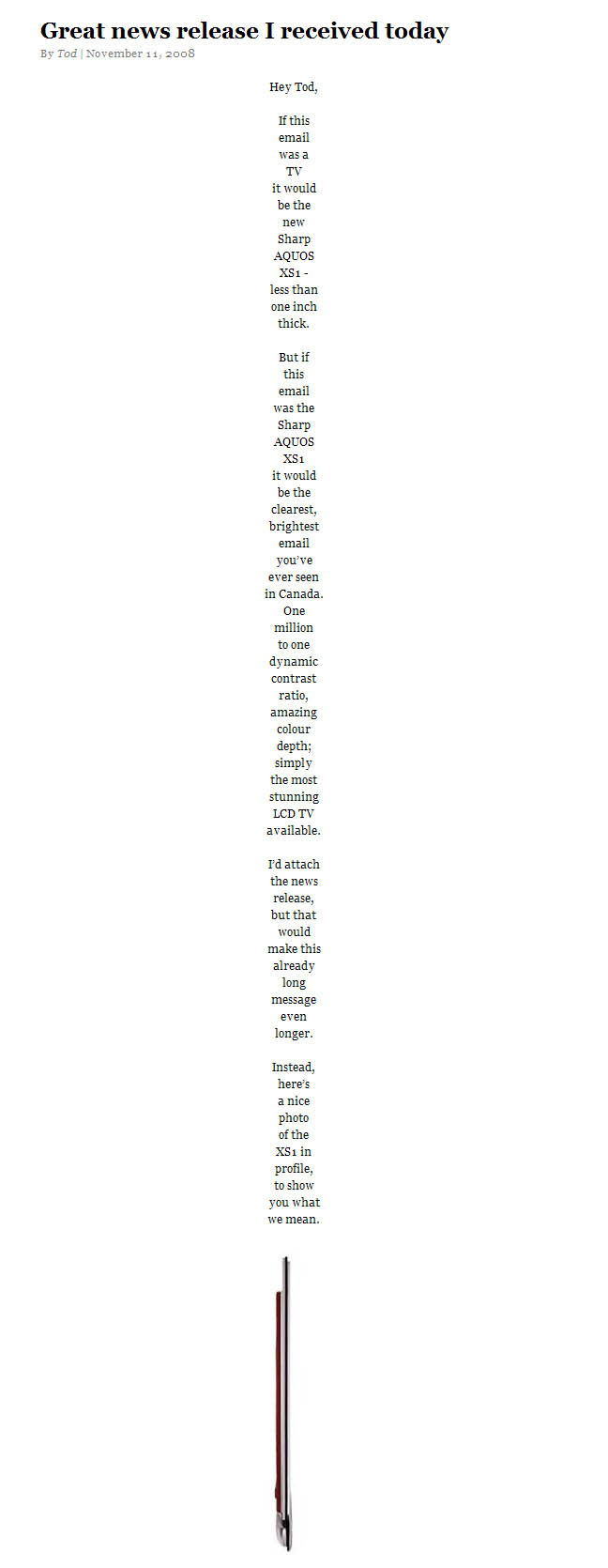
So, imagine my delight when Tod Maffin’s post showed up in Google Reader last night. You have to see to understand. Here’s Tod’s post:
Form mirrors content. Awesome.
The team could simply have sent the news release to the bloggers they wanted to reach out to. But they didn’t. They did something else. A slimmed down pitch that conveyed in its form the core feature of the Sharp Aquos XS1.
A simple pitch. An elegant pitch. An effective pitch.
I’m really, really proud of the creative people I work with. So, here’s a public shoutout to Michael O’Connor Clarke and his Sharp account team. Keep it up
And thank you Tod for liking the pitch.

